In the first part of this blog series, I wrote about what is design audit and why is it important. If you haven’t already, read it here.
Now that we know about design audit and its importance, let’s move into the steps to conduct a successful design audit. I will take an e-commerce website as an example to explain this.

1. Understand Business Goal
Understanding business goals is crucial in conducting a design audit. Here are a few steps you can take to gain a comprehensive understanding of business goals:
- Identify the key stakeholders involved in the project, such as business owners, executives, product managers, or marketing teams.
- Conduct interviews or meetings with the identified stakeholders to gather information about the business goals, objectives, target market, desired outcomes, and any specific metrics they are focused on.
- Review relevant business documentation, such as business plans, marketing strategies, or product roadmaps.
- Differentiate between long-term and short-term business goals.
- Communicate the understanding of business goals to stakeholders and seek their validation. Ensure alignment and agreement on the identified goals and their importance.
2. Define and Study User Persona
If the organization has existing user personas, it should be collected. Personas are fictional representations of the target users and include details about their demographics, behaviors, goals, and pain points. If there are no existing user personas, work with stakeholders to create them. Use market research, surveys, and user interviews to gather insights about user characteristics and behaviors.
For each persona, key characteristics such as age, gender, occupation, location, education, and technology proficiency should be outlined. This helps to create a clear picture of who your users are. The user journey for each persona should be mapped out. This involves documenting their interactions with the product from start to finish. The touch-points, emotions, and decision-making processes should be understood. How well the user personas align with the business goals should be checked. Are the personas representing the target audience that the business aims to serve? This alignment is very crucial for a successful design audit.
3. Conduct Heuristic Evaluation
Conducting heuristic evaluation helps to identify usability issues based on established usability principles, enabling us to make informed decisions for improving the user experience. Nielsen’s Ten Usability Heuristics, formulated by usability expert Jakob Nielsen, is a set of principles that guide the evaluation of user interfaces for usability. These heuristics help identify potential usability issues and areas for improvement in design.

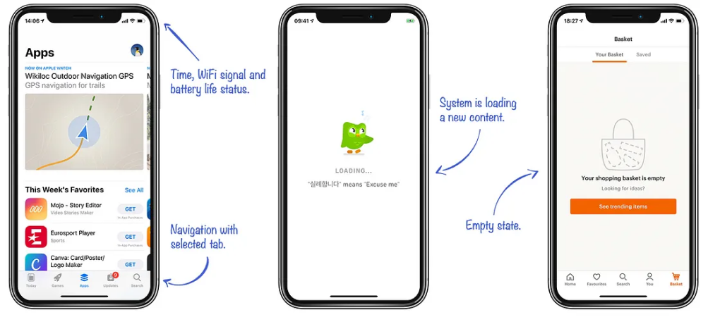
a. Visibility of System Status:
Users should be informed about what’s happening in the system.
Users should receive timely feedback for each of their actions. For instance, when someone sends a message, they should see a loading symbol to know the message is being sent.
b. Match Between System And Real World:
User interfaces should use language, concepts, and design elements that are familiar to users from their real-world experiences. Interfaces should follow the conventions and mental models that users already have, making navigation and interactions intuitive and understandable. In an e-commerce site, people are already familiar with the “cart” icon, which shows their selected items, just like an actual shopping cart. Users might get confused if other icons are used instead of a cart icon.

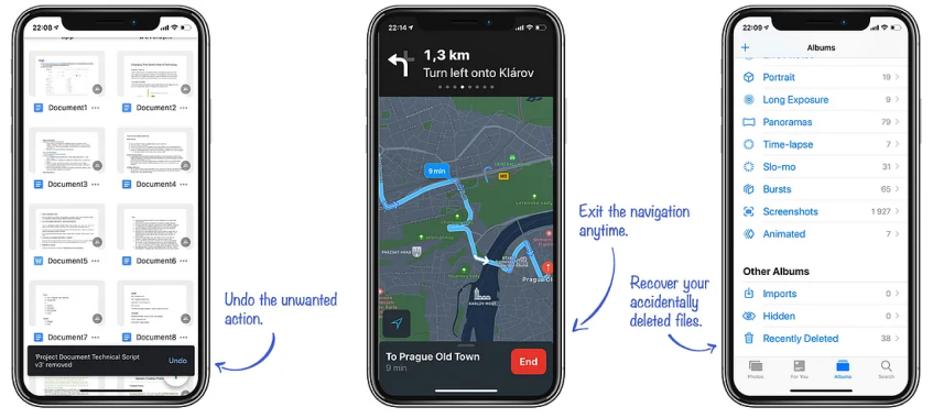
c. User Control And Freedom:
Users should be able to freely navigate the interface without being trapped in unintended actions. This approach encourages providing “undo” options, clear exit paths, and mechanisms for users to recover from errors without losing their work. If someone accidentally deletes a file, they should have an “Undo” option to bring it back. It’s like having a “Ctrl + Z” for real-life actions.
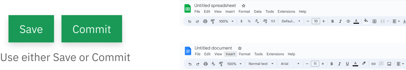
d. Consistency And Standards:
This emphasizes the importance of maintaining uniformity and adhering to established conventions in user interface design. Consistency in different visual elements like buttons, icons, color schemes, and layout structures should be maintained throughout the interface so that the users can transfer knowledge gained in one part of the application to other areas, reducing the learning curve.
Check the consistency of all the applications of Google Suite.
e. Error Prevention:
This focuses on anticipating and minimizing user errors through careful design. The design should help them understand the consequences of their actions and guide them on how to avoid errors instead of handling the errors later. Suppose, in an input field that accepts only PDF file formats, if the required information is given, then there is less chance that the user uploads other file formats. Preventing errors saves users time and resources. Correcting mistakes, especially in critical processes, can be time-consuming and frustrating.
f. Recognition Rather Than Recall:
This emphasizes the importance of making information and actions visible and easily accessible to users, reducing the need for them to remember details from one part of the interface to another. Users can make decisions and complete actions more quickly when information is readily available. Can we even imagine what it would be without the Bookmarks feature? It allows you quick access to that page instead of having to recall it.
g. Flexibility and Efficiency of Use:
The design should be user-friendly for all types of users. Even if we currently have a single user group, it’s important to consider both beginners and experienced individuals. It’s crucial to cater to the needs of both novice users and those with more expertise. It’s worth noting that everyone, including experienced users, started as a beginner at some point. Efficient workflows and the availability of shortcuts contribute to increased user productivity. For instance, the shortcuts in the keyboards when using different applications. The example below is the keyboard shortcuts of Photoshop. The users, especially experts, can complete tasks more quickly and with fewer steps.

h. Aesthetic and Minimalist Design:
A clean and visually pleasing design minimizes distractions and focuses on essential information. Simplicity contributes to a more focused and efficient user experience. Too much unnecessary information makes it harder and overwhelms the users to find what they really need.
For example, the Apple website features a clean, uncluttered layout with plenty of whitespace to highlight critical elements.

i. Help Users with Errors
Error messages should be clear and specific and guide how to correct mistakes. They should help users understand the issue, diagnose the problem, and suggest appropriate solutions. If someone uploads the wrong format of a file, then just a pop-up showing “Error” is not enough to tell them what’s wrong; the error message should show the proper reason why the file failed to upload and what steps should be taken for a successful upload. It’s like a doctor diagnosing the issue and suggesting a remedy.

j. Help and Documentation
Users should be able to find the information they need quickly without relying on external sources. Having a clear “Help” section in the app where users can easily find answers to common questions can make the user feel like having a friendly guide who knows everything about the app.

Step 4: Understand Behavioral Metrics
In a design audit, understanding behavioral metrics involves analyzing user interactions and behaviors within a digital product or interface. These metrics provide valuable insights into how users interact with the design, their actions, and where they may encounter challenges. Several tools like Google Analytics, Hotjar, and Crazy Egg are available to help understand behavioral metrics in a design audit.

Step 5: Understand Attitudinal Metrics
Understanding attitudinal metrics involves evaluating users’ attitudes, perceptions, and opinions regarding the digital product or interface. Unlike behavioral metrics, which focus on how users interact with the design, attitudinal metrics dive into users’ subjective experiences and feelings. Involving in stakeholder interviews, competitive research, and user interviews and surveys can benefit this process.

Step 6: Create Audit Reports
Audit reports can finally be documented after following the above steps according to the needs. It is crucial to communicate findings, recommendations, and actionable insights resulting from the audit process.

Step 7: Make Priorities
While making the priorities, the report can be tailored in specific formats and content to meet the needs of stakeholders, whether they are designers, developers, product managers, or executives. Effective communication of findings and recommendations is essential to drive actionable insights and foster positive changes in the design process.

Final Thoughts
By conducting an audit, the UX pitfalls can be eliminated, the brand can be strengthened, and we have a deeper understanding of the product and gain valuable insights for ongoing innovation.
Interested to read our other article from our experienced designers? Explore our blog here
Watch the full video of Robina’s talk in G1 conference.
…….……..
Have an idea that you want to bring to life? Experience the power of thoughtful and user-centered design with Gurzu. Book a free consulting call with Gurzu experts today!