UniTaskPro is a task management app whose target market is universities and educational institutions. It allows the institutions to create various departments and assign different projects and users to them. You can also create specific user groups with specific access to certain departments & projects. With all these features, you can create various tasks, sub-tasks & checklists for those projects, ultimately giving you granular control over your whole institution.
Problem Statement
One of the main issues with the current state of the application was that the signup process was very time-consuming and confusing. With the addition of a brand new monetization model and a complete rework of the Role-based Access Control (RBAC) system, first-time users didn’t know where to get started with their account. It hampered the user experience of the new and existing users. In this case study, we will explore these pain points and address them by making the signup process simple and easy to follow, simplifying the RBAC system so that it’s easy to set up, and creating a way to guide first-time users.
In this case study, we will explore these pain points and address them by making the sign up process simple and easy to follow, simplify the RBAC system so that it’s easy to set up, and create a way to guide first time users.
User Research
Because we had access to a diverse group of individuals from both technical and non-technical fields, we conducted usability testing with those participants to identify pain points and uncover usability flaws, especially when they signed up for the first time. They were observed and weren’t guided through the signup and onboarding flow. This helped us uncover common pain points, such as confusion during the authentication steps and where to go when they reach the dashboard.
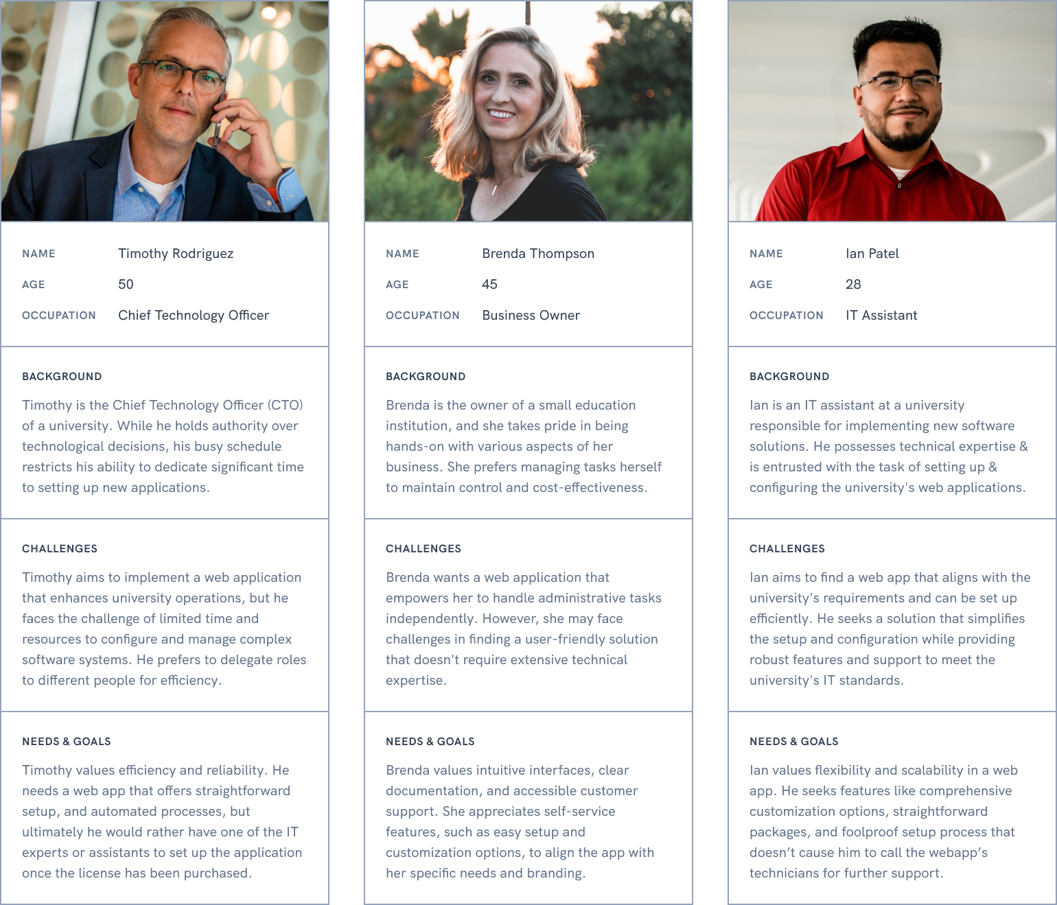
Personas
Based on research participants, we determined three user personas to get us started with. They varied based on their occupations, their backgrounds, and their challenges and helped us with a much-needed context.
Ideation & Brainstorming
We have determined that three different flows needed to be focused on:
- Sign Up: The user should be able to get to the application’s core with the least steps possible.
- First-time Dashboard: The onboarding process does not exist for first-time users.
- RBAC Rework: The RBAC system should have departments, sub-departments, and project levels.
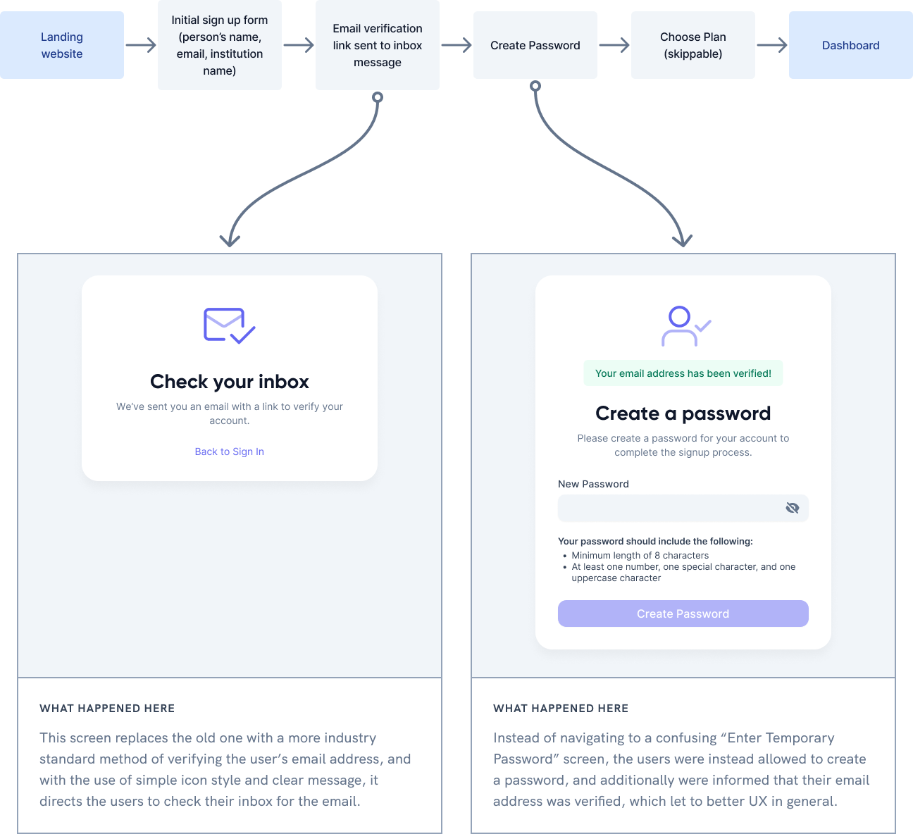
Streamlined Signup Flow
We identified that the initial signup flow contained two redundant steps, causing confusion for users and increasing friction during the onboarding process.
- To verify the user’s email, we opted for a verification link rather than a temporary password to verify the email.
- You can create a new password once the verification link has been clicked.
- Rather than requiring the users to sign in again after completing the signup process, we removed that step altogether.
- We made the plan selection screen skippable, and once skipped, the default selected plan would be “Free,” as choosing a plan is mandatory.
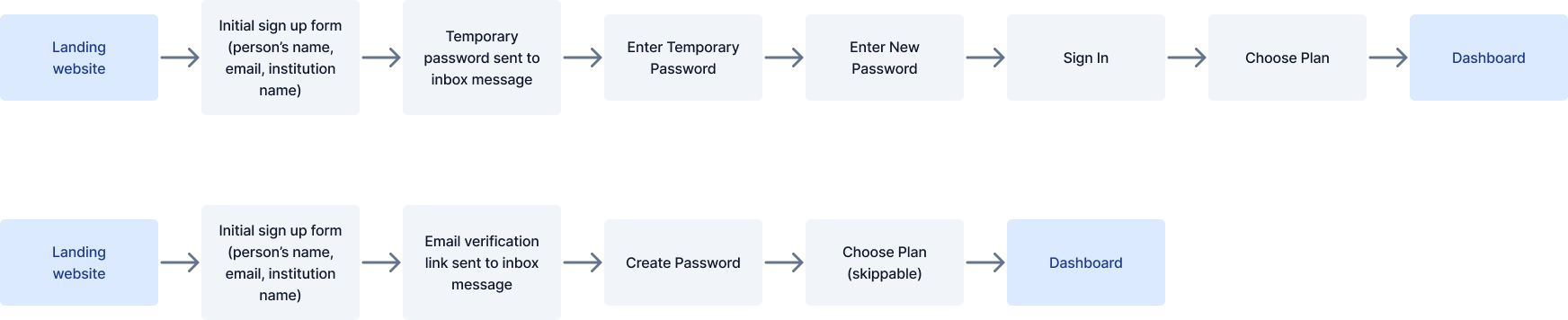
Additionally, we used straightforward-to-follow success instructions that guide the users forward. This had a positive effect as those instructions helped the users go through all the signup steps seamlessly.
By eliminating these redundant steps, the resulting signup flow became more streamlined and accessible for first-time users.
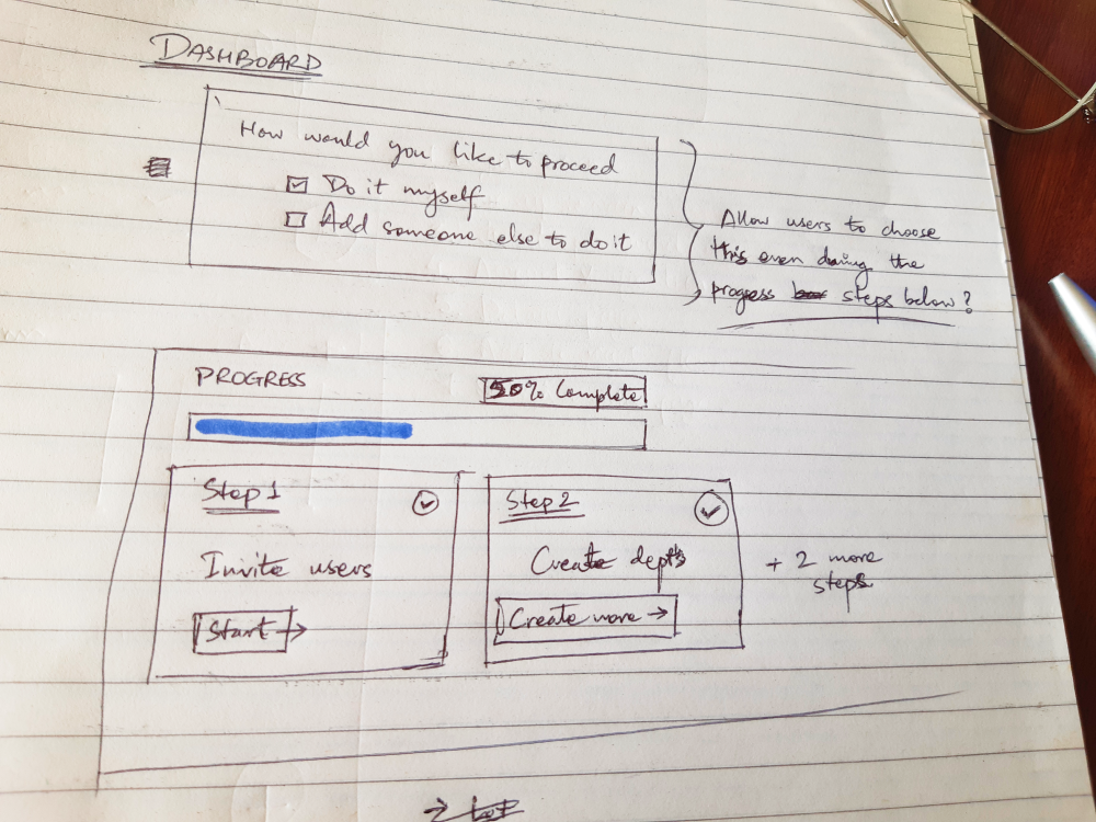
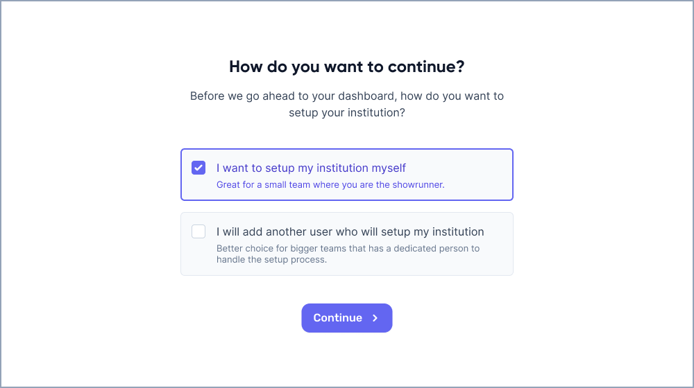
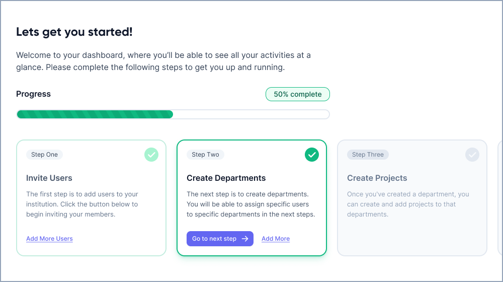
Redesigned Dashboard with Setup Guide
After the users signed up, the dashboard lacked information regarding the next steps. Therefore, we created an easy-to-understand guide that the users can follow step by step.
- The users are first introduced to either setting up their account themselves or adding someone else to it to set up the rest.
- A set of steps is provided to the users to help them understand how the admins can set up the account, invite users, create user groups and departments, etc.
- The users can redo a particular step multiple times throughout the process.
- A handy progress bar motivates the user to complete the steps.
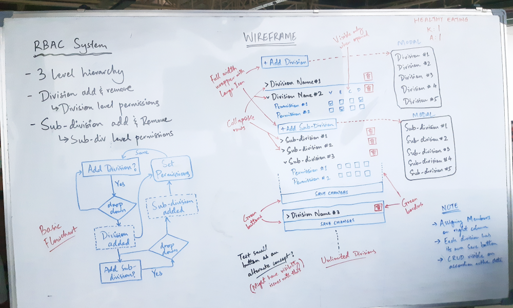
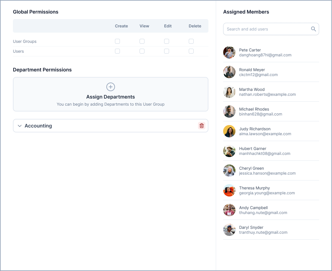
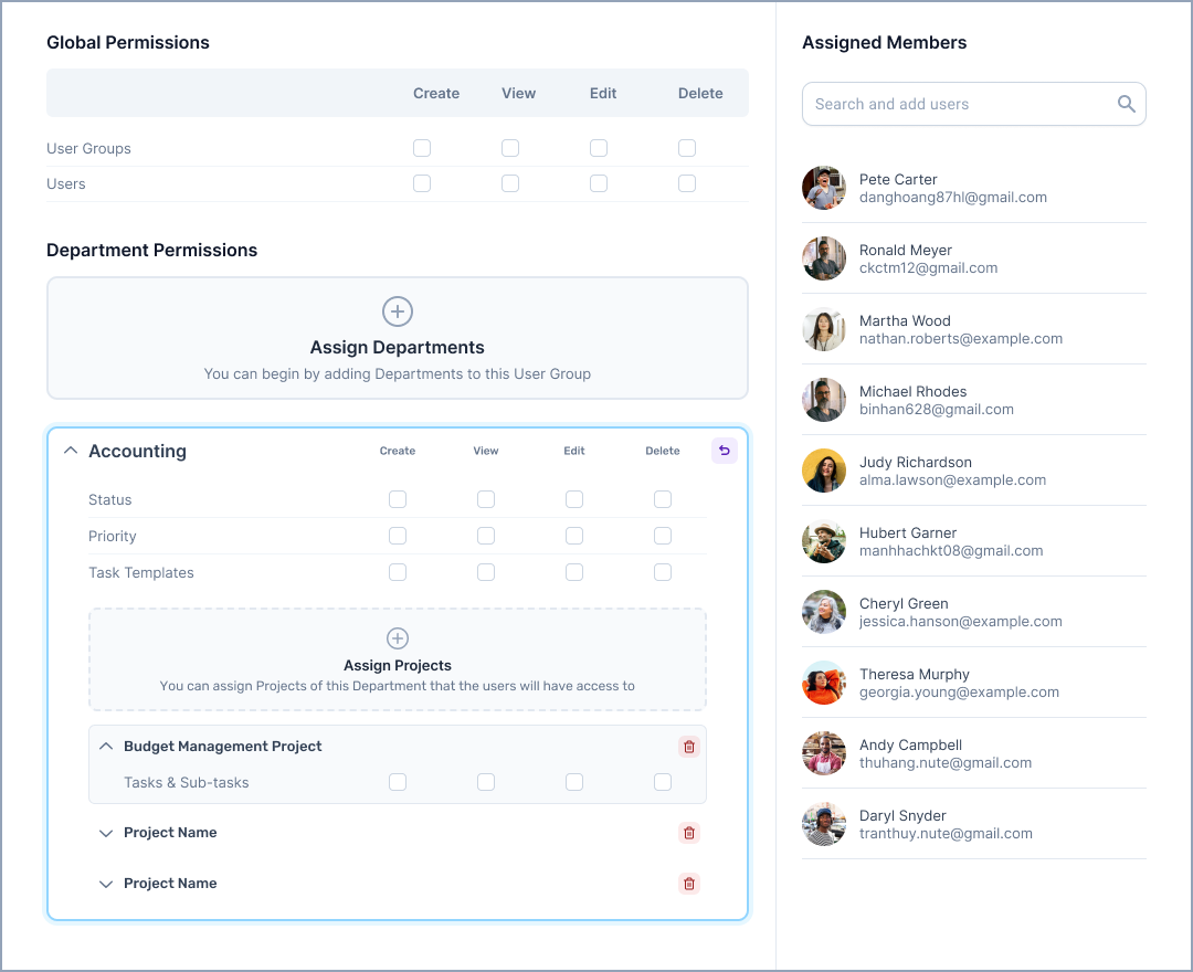
Reworked User Groups (RBAC System)
One of the crucial steps when setting up your account is to create user groups that reflect your organization, with proper permissions and access. The reworked system needed the ability to create and edit user groups and set global, department, and project-level permissions. Users could also be added to and removed from those user groups. Licenses can be assigned to departments only, without the addition of projects. You can also create User Groups without adding any users.

UI Design
We improved the user interface (UI) design to enhance the signup flow, dashboard, and user groups section. Here are some fundamental changes we made:
Signup Flow
- We added helpful text and instructions throughout the signup flow to guide users and provide clarity.
- Unnecessary steps in the signup process were removed to make it quicker and easier for users to complete their sign-up process.
Redesigned Dashboard
- The dashboard was updated to include step-by-step guides that assist users in setting up their departments, user groups, and projects and inviting team members.
- These guides provided clear instructions and visual cues to help users navigate each setup task.
Reworked User Groups Section
- User groups were redesigned for specific permissions based on departments and projects.
- The departments and projects were converted into collapsible blocks, allowing users to simultaneously add and maintain licenses of multiple departments and projects and not feel overwhelmed by the sheer volume of information on the screen.
Usability Testing
We created interactive prototypes based on these updates and conducted a usability test to evaluate their response. The users responded positively to these changes, finding the signup process more straightforward, the redesigned dashboard with step-by-step guides helpful, and the improved RBAC system pretty simple despite its apparent complexity. The testing results indicated an overall increase in user efficiency, reduced confusion and helped save users valuable time.
Key Takeaways
In conclusion, this case study highlights the positive user experience due to the design enhancements to the signup process and the dashboard. The simplified signup flow and redesigned dashboard with step-by-step guides have made onboarding easier and, in a sense, allow the users to hit the ground running. However, further real-world user testing is needed to gain deeper insights and refine the User Groups RBAC system. This iterative process will ensure ongoing improvements to the overall user experience of the system as the system on its own is a pretty complex and powerful element of the whole application. The addition of further safeguards would ensure that the users would be able to recover even if they make any mistakes.
Overall, this study highlights the success of the UI and UX enhancements and the commitment to user-centric design that aided the project’s current version to be a lot more user-friendly.
At Gurzu we strive to make your tech ideas into reality with intuitive designs. Need help with your new tech project? Book a free consulting session with us or leave us a message and we will reach out to you!
Enjoyed this case study? Read a similar case study of SportsLink, a Fitness App.