FotoSphere is a photo sharing app designed to capture and curate thoughtful collections of life’s most remarkable moments and unforgettable memories. You can create personalized albums, add select images to those albums, and share them exclusively with your close circle of friends and family.
FotoSphere offers a unique take on posting your photos, where you can upload only one image per day for each album. This intentional limitation ensures that you post the highlight of the day and seamlessly scroll through your life’s moments without feeling overwhelmed by an excessive number of photos. Moreover, you have the flexibility to replace or delete the uploaded image within a 24-hour window as you see fit.
Problem Statement
A lot of users encounter challenges when searching for a photo sharing app that allows them to share cherished moments with loved ones while maintaining a clutter-free and meaningful UI and UX. Existing applications often overwhelm users with tons of images without the existence of personalized sharing features, which leads to dissatisfaction with the overall experience. That being said, we had two key features and ideas that we needed to iterate on throughout the design process:
- Presenting photos of each day in a timeline could be a bit complex, but it is feasible to develop a user-friendly and visually appealing solution.
- Users need to be able to react and post comments on photos to boost user engagement and cultivate a sense of community among their peers.
Objective
The product plans to acknowledge the above problems, and we followed the objectives that it plans to fulfill.
- Create an intuitive concept that lets users curate photos every day and showcase their collections to their closest family and friends.
- Give users fun ways to interact with their friends’ photos without being visually intrusive.
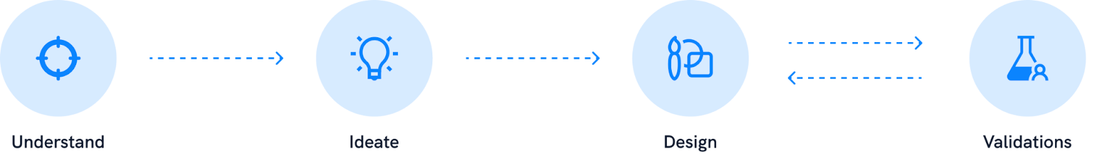
Design Process
As the Product Designer on this project, I was leading the design process by coming up with concepts and ideas through brainstorming sessions, whiteboarding and discussions with the rest of the team, while also working on the visual foundations keeping the user experience in mind.
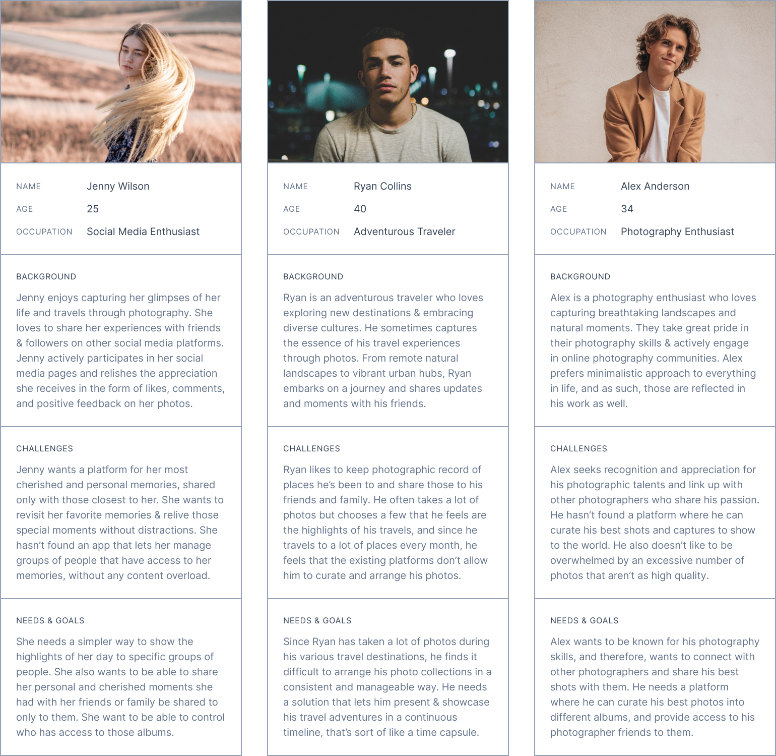
User Research
We initiated the user research process by identifying and defining our target audience. The stakeholders’ assistance was invaluable during this process as they had wide access to their target audiences, namely ranging from 18 to 40 years old. Through various surveys and interviews, we got valuable information about potential users and a wide range of interests, including photography enthusiasts, travel enthusiasts, nature lovers, and social media users.
User Persona
Based on the data that we collected and identifying common behaviors and needs, a few user personas were created that represented the target audience.
Ideation and Brainstorming
The idea of restricting albums to a single image upload per day helps to prioritize quality, purpose, and curated galleries. Going ahead with this concept requires thoughtful planning and execution while being in line with FotoSphere’s overarching vision and target audience, and there’s potential to set FotoSphere apart by offering users a unique and engaging experience. During the brainstorming process, we realized that two key features needed major focus to make sure that we fulfilled the client’s needs.
- Photo Timeline: Since there would be a limited number of photos on each album, there were discussions on creating a carousel for those images. This would go through tons of iterations until we reached a more natural approach.
- User Engagement Features: The users should be allowed to engage with and interact with other photos through reactions, comments, and comment reactions.
UI Design
Photo Timeline
The photo timeline is the collection of pictures uploaded by the user in an album. There were numerous ideas tossed around during many discussions, and the client’s initial focus was on an interesting and eye-catching carousel design. As those ideas were implemented in a functional demo, it became clearer that such an idea needed to be further iterated upon, which you will see below.
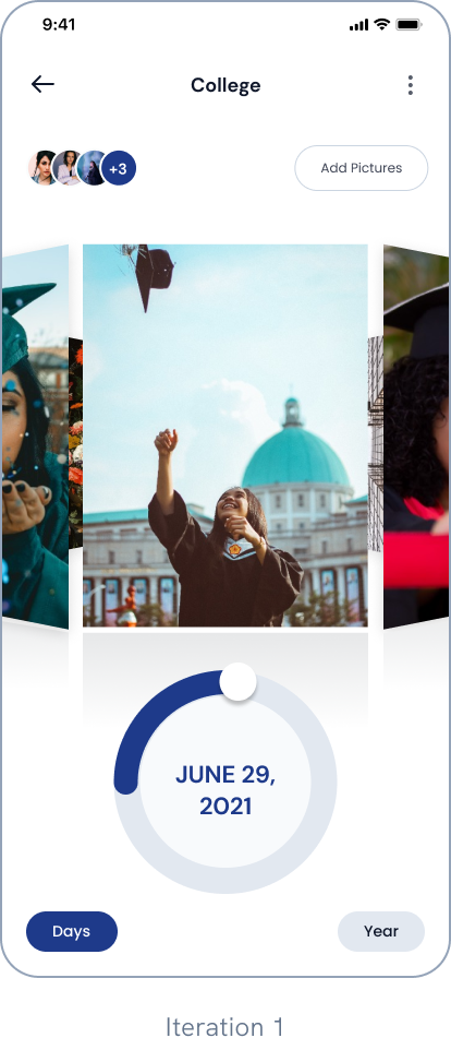
Iteration 1: 3D Image Carousel
During this iteration, we worked on the idea of having a 3D image carousel to provide a distinctive and eye-catching presentation. But implementing this became quite a challenge due to the technical constraints we had on the platform that was being used to create the mobile application.
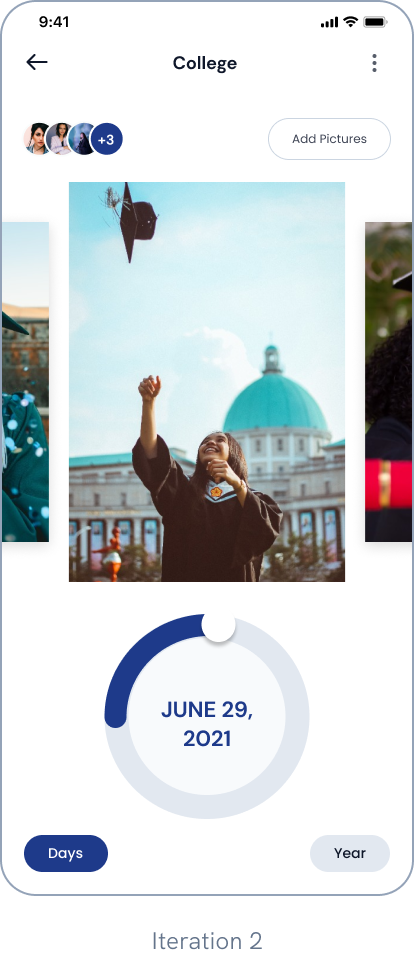
Iteration 2: Flat Image Animation
The 3D image carousel concept was quickly replaced with a flat 2D image carousel that was much easier to implement. Despite this change, there were a few major usability issues with this version, especially with the circular dial. Due to the lack of proper tactile feedback and an obvious lack of a physical circular dial, it was likely for the users to lose the tap area. On top of that, using the dial was counter-intuitive when trying to scroll to a precise photo that you’re looking for.
Iteration 3: Changing the slider
We assumed that changing the slider itself to a horizontal timeline slider would fix some usability issues, but even during prototyping this concept, it was becoming quite clear that the carousel view itself was not going to work at all.
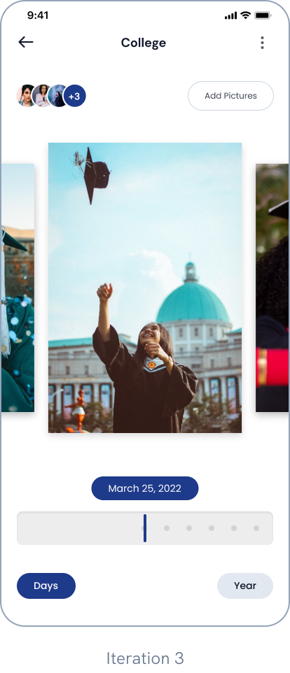
Iteration 4: Not reinventing the wheel
After the first few iterations, it became evident that even though having a carousel and slider combination was visually appealing to look at, we weren’t considering the experience of the end users. With that in mind, we went back to the drawing board and went back to the basics.
A vertically scrolling timeline of all your photos was clearly a better choice, as it is much more natural and intuitive for the users. A simpler filtering option to filter between days, months, and years, with the option to see all photos, was laid out clearly at the bottom of the screen. All of this had a positive response from the internal team as well as from the client.
User Engagement Features
Getting to comment on a photo was crucial for user engagement. Instead of creating an opaque drawer for the comments, it was decided that the comments being visible over a translucent overlay was both visually appealing and kept the users in view of the image. Additionally, you could also add pre-made stickers as a comment if you wanted to.
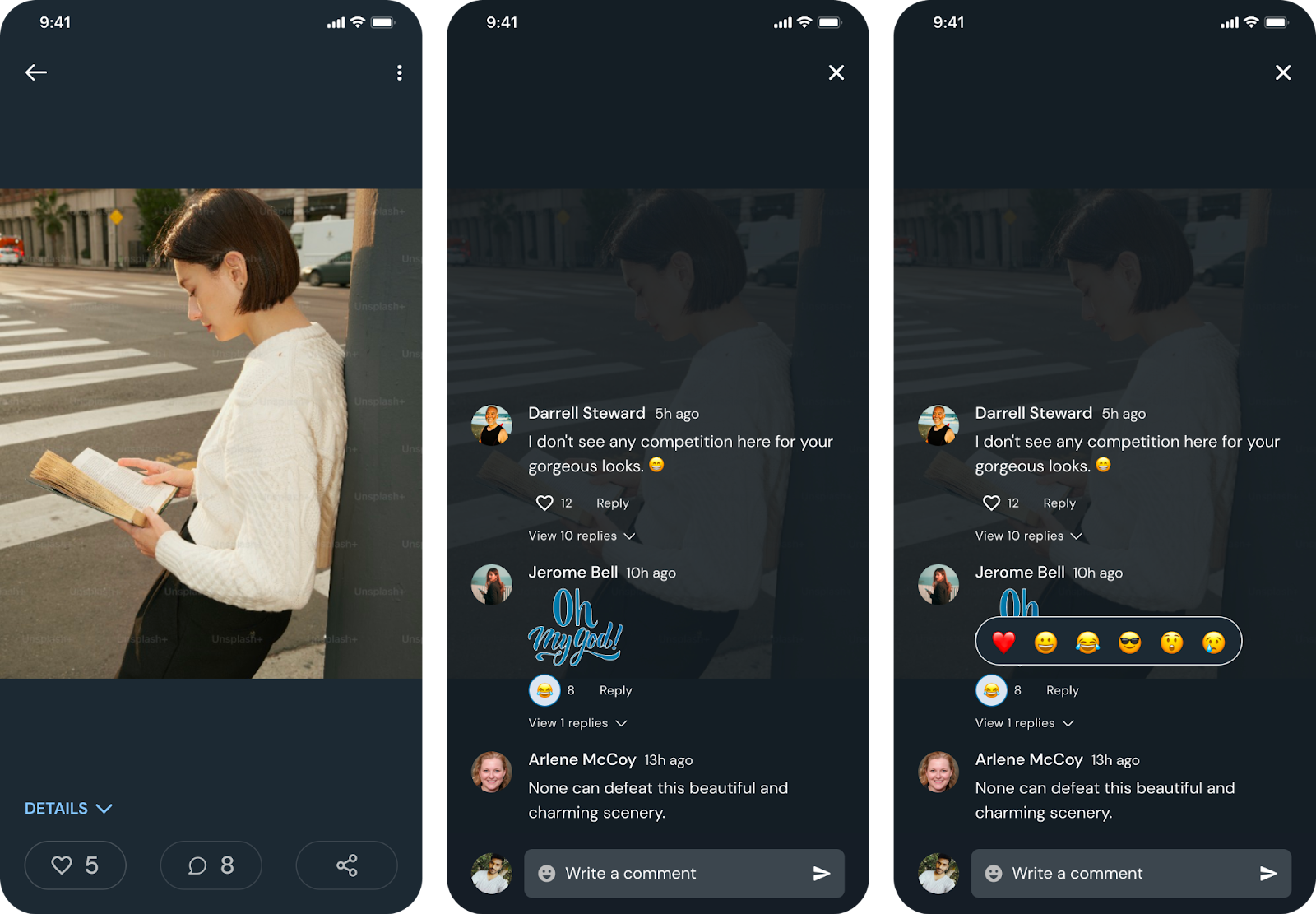
There was also a clear need for emoji-based reactions, which let users personalize what they feel when they see a photo. This feature was extended to the comments panel, where you can react to someone’s comments as well.
Key Takeaways
Working on this project gave me a lot of insights and ideas, especially when ideating the different versions of the photo timeline. After multiple iterations, we were able to finalize its design, and the result led to users reacting positively to its intuitive and easy-to-follow UI. The inclusion of features like comments, reactions, stickers, and comment reactions significantly increased user engagement throughout the app. On top of that, the addition of albums helped enthusiasts and active users sort images into different albums and add specific people to them.
Thanks to the constant communications, discussions, and brainstorming sessions done with the product team and the stakeholders, we were able to create a successful product that people can use in their daily lives to curate and save their cherished memories.
Read More
We have a lot of product design case studies like this! Read them here:
- UniTaskPro : A task management app targeted to universitie
- SportsLink : A fitness app designed to connect you with like-minded individuals, discover new training sessions, and elevate your fitness journey.
- Steps in Product Design : The Gurzu Approach
.……………………….
At Gurzu we strive to make your tech ideas into reality with intuitive designs. Need help with your new tech project? Book a free consulting session with us or leave us a message and we will reach out to you!