SportsLink is a unique fitness app designed to connect you with like-minded individuals, discover new training sessions, and elevate your fitness journey. In this case study, we will delve into the creative process of the Gurzu design team, exploring the challenges and breakthroughs that have shaped SportsLink into the app it is today.
Problem Statement
Finding people with similar hobbies and interests in a health club or fitness environment is not an easy task. Similarly, meeting new people or training partners is difficult, especially if you’re a woman, a person of color, or part of the LGBTQ+ community.
This process often involves jumping between various apps, which is challenging to keep track of. Moreover, concerns about the quality and safety of health clubs and trainers can lead to bad experiences, which in turn could cause them to abandon their interests altogether.
Objectives
The product plans to acknowledge the above set of problems and has the following objectives that it plans to fulfill:
- Connect people with each other based on their interests, hobbies, common health clubs, as well as geographical proximity (location)
- Allow users to chat with people they’re connected with
- Add health clubs to their profiles to increase discoverability and a chance to connect with people you may already know or be friends with, but not realize that you all go to the same health clubs
- Let users rate the vibe of health clubs based on their own experiences
- Let users create sessions or join sessions near their location
- Let sessions attendees talk with each other and send session updates and photos via the session chats
User Research
We prepared and sent out a short 5-point Likert scale questionnaire to a handful of potential users. We gathered insights on their chosen ways of connecting with potential health club partners & their decision-making process for joining fitness centers. Based on their answers, we determined their behaviors, needs, preferences & habits towards health clubs, finding training partners, connecting with new people, and participating in various fitness events.
User Personas
By analyzing the data & identifying common patterns, behaviors & needs, a few user personas were made that represented the target audience, highlighting their goals, motivations, pain points, and characteristics.
Here is an example of what a user persona would look like:

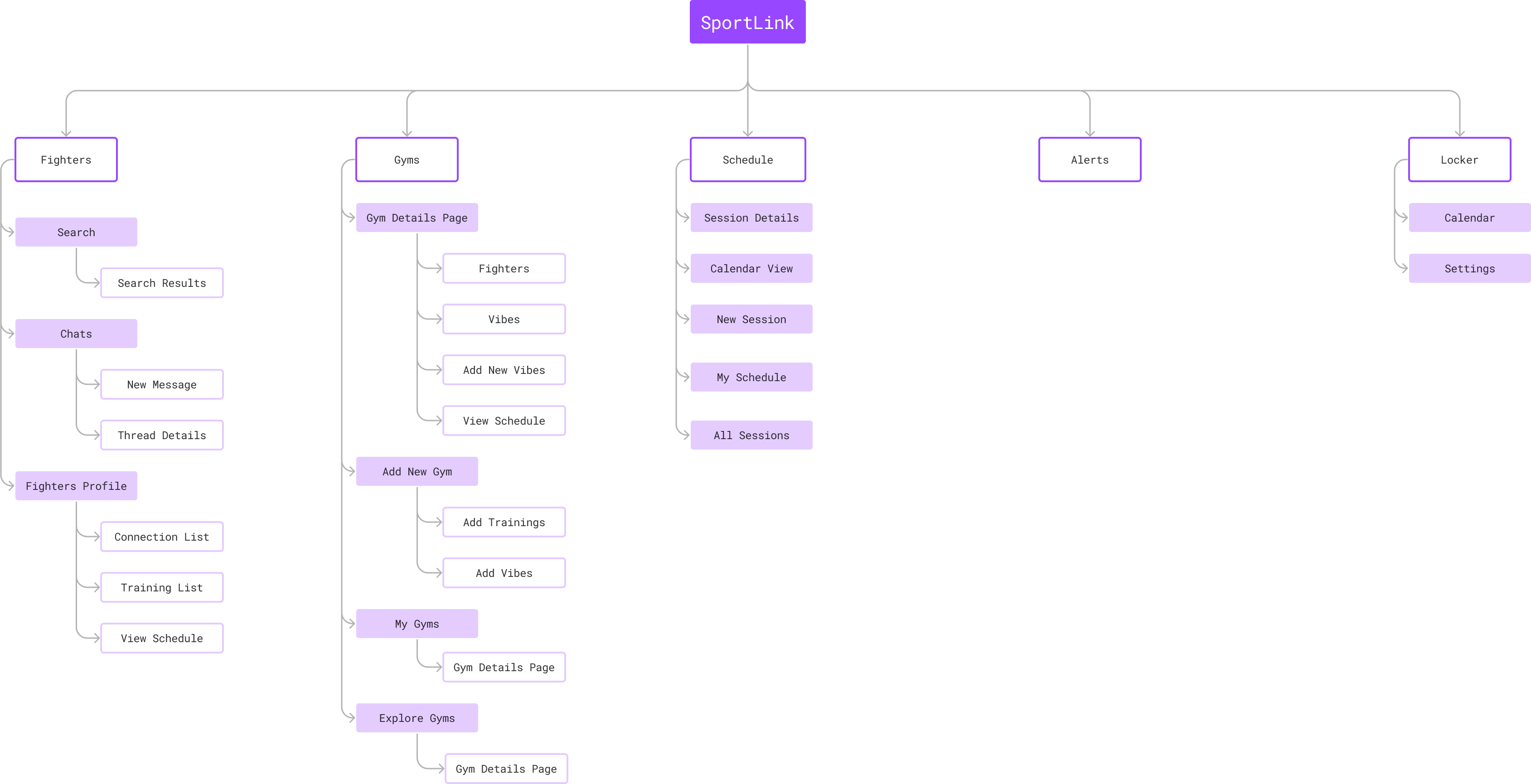
Sitemap
Based on the client’s requirements, we laid out the necessary pages and sub-pages. Doing so helped us understand the link between them, ultimately easing our design process.
Design Process
After knowing about the users and acknowledging their problems, we started the design process with the following steps:
- Brainstorming and sitemaps: We started with listing out ideas on sticky notes and separating them by “must haves,” “nice to haves,” and “and not needed.” We scribbled some interesting ideas on a whiteboard and discussed them in detail with the project team. During this period, we also informed the client about our thought processes.
- Sitemaps: We created flowcharts and sitemaps to break down how different sections would be connected with each other.
- Wireframes: To get some of the concepts across, we created a handful of wireframes and demoed them to the clients. This helped clear a lot of ideas that were difficult to explain through flowcharts.
- High-fidelity mockups: The wireframes were then used as the basis to create high-fidelity mockups and were also turned into interactive prototypes to demonstrate further the concepts that we were going for initially.

Iterations
Some concepts and layouts were iterated upon multiple times throughout the product designing phase until we settled on a finalized version. Getting to repeat the previous ideas multiple times allowed us to think outside the box and come up with creative solutions. Some of the significant iterations made in the wireframes have been highlighted below.
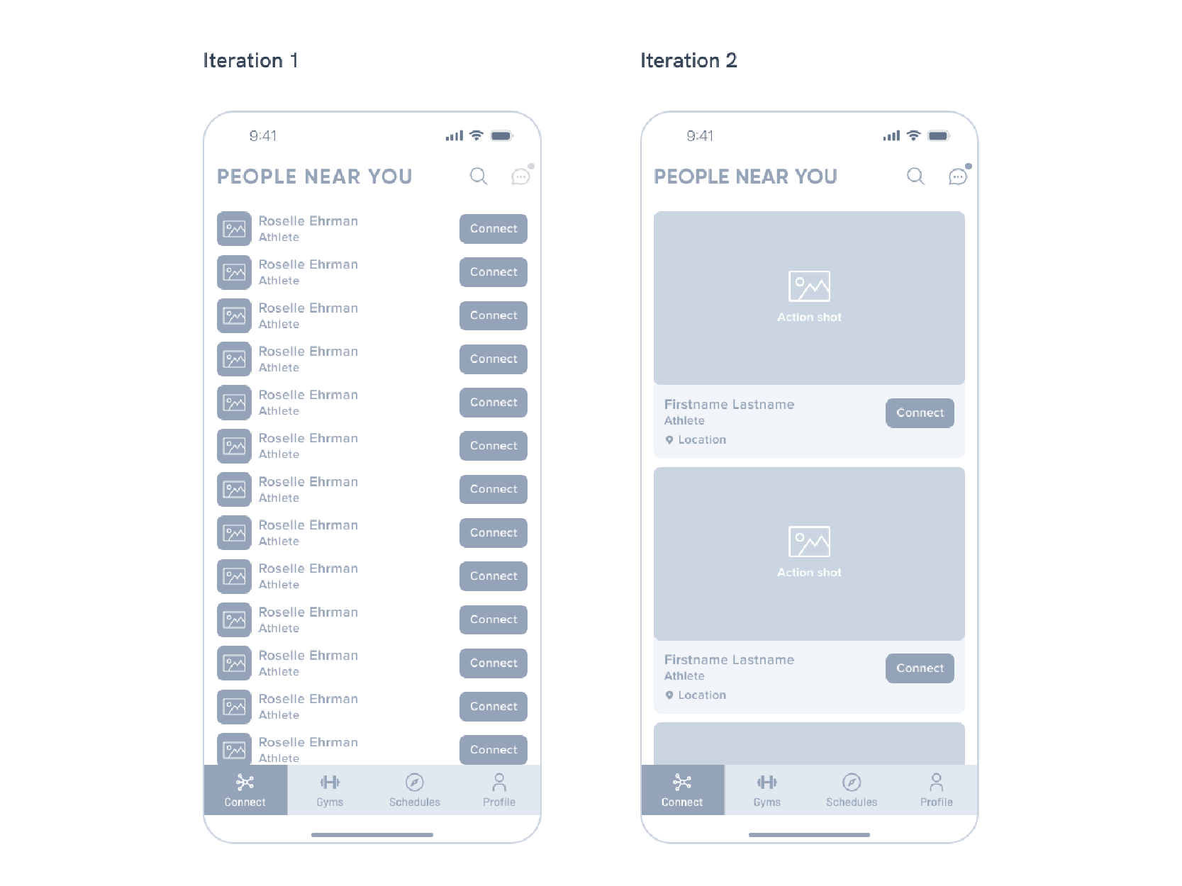
Fighters
In the fighters tab, the user can connect with other people, search for athletes and people they already know, and chat with their friends.
In the earlier iterations, the fighters tab had a list of fighters with small profile pictures, their names, roles, and an action button. This layout was quite simple and showed a lot of users at a glance, but the overall experience felt uninteresting and dated.
The latter iterations completely redesigned the structure, and we opted for cards instead. This meant that the user profile pictures would be very prominent and the central focus of the page, but also that the profile pictures needed to be a lot more “action-packed” instead of face shots.
To solve this problem, we ultimately decided to change the “Upload Profile Picture” to “Upload Action Shot” during the sign-up process to promote using more dynamic-looking photos for their profiles.
The final iteration was a creative solution to a slightly mundane format, given the limitations and challenges we had for this page.
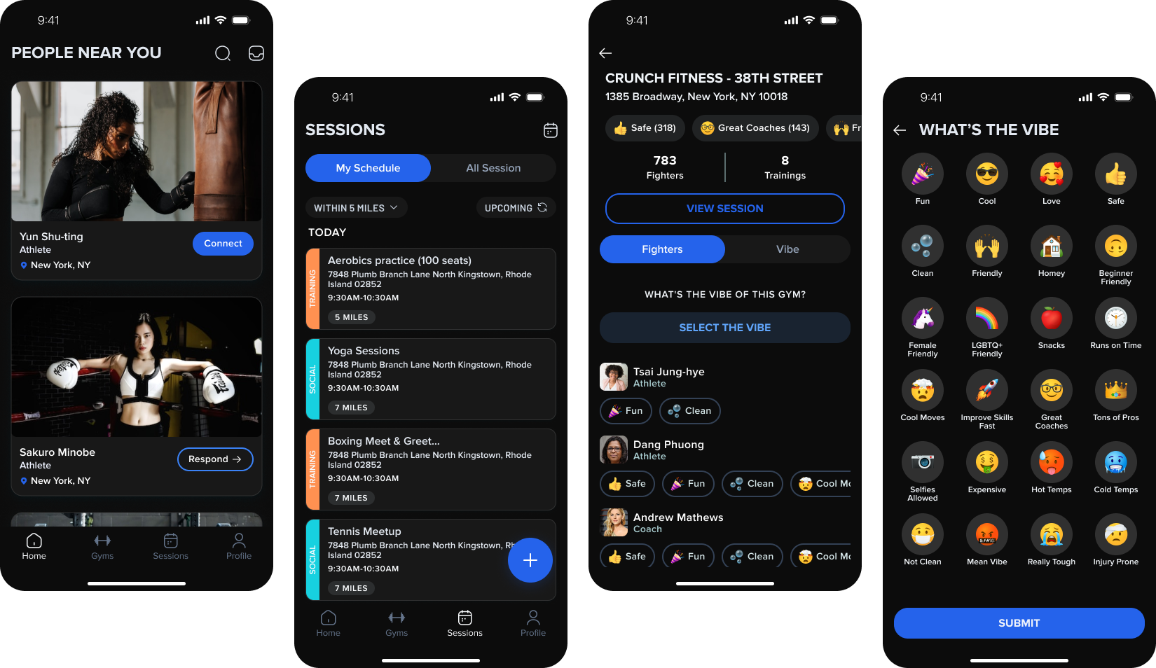
Sessions
Sessions is a portal to finding various training sessions created by other athletes and also the place for uesrs to create their own.
During the first few iterations, we thought of all the possible use cases for this screen. We added features like viewing the training partners, attending health clubs, connections’ schedules, our schedules, and the ability to create new sessions, among others, all from the same page. We could also view the sessions in a calendar layout.
Despite the primary purpose being the need to show all session-related details, the layout felt cluttered and a bit overwhelming to the users.
With this new revelation, we trimmed out all the unnecessary clutter and devised a more straightforward layout for this screen. In these versions, the primary focus can go back to the list of sessions, with a more visible plus button to create new sessions. We could also see active and pending sessions. While this version was a lot better UX-wise compared to the first few iterations, it still lacked some clarity on how the whole sessions system worked, as there were talks of being able to view sessions near you.
This led to further enhancement of this screen to the final iteration.
In the final iteration, we changed the overall concept of how the sessions would be displayed and separated the tabs into “My Schedule” and “All Sessions.” My Schedules would have sessions one would be participating in, and All Sessions would have sessions from different people near your location. We also allowed the users to filter sessions by distance and by time, i.e., upcoming or past sessions. This version gave the Sessions page much-needed clarity on what the page was supposed to be.

Vibes
One of the key concerns expressed by the users and the client was that the normal star rating wasn’t descriptive enough to explain the good (or bad) aspects of a particular health club. A higher star rating wouldn’t clarify if a health club is friendly to beginners, has great coaches, or is really tough on the athletes. It was necessary to come up with a different approach to rating health clubs.
Therefore, we developed a “vibe rating” concept that allows you to select your experiences in the health club specifically. The vibes ranged from positive to negative emotions & experiences, enabling the users to give a more realistic description.
There were discussions on whether to include a comments feature in the ratings, but adding that into the mix would clutter the ratings section further, and the vibes were descriptive enough for the users.

UI Design
After the completion of wireframes, we developed a design system and style guides as per the brand guidelines. We refined the user interface and made them visually appealing while aligning the design with the brand’s vision. Please note that the following samples are not the actual UI of the final product as we wish to protect the client’s intellectual property; instead we’re simply giving a reimagination of the UI based on the wireframes.
Usability Testing
Once we created the prototypes for that UI, we distributed them to a small group of users to get their feedback and insights.
There was an overall positive response to the mobile app, and the users mentioned that creating and joining sessions felt intuitive and effortless to keep track of. Additionally, they mentioned that the health club details page, in particular, was unique but a welcome change from what they saw in other apps regularly. There were minor design tweaks and changes to ease the development process, but in essence, the final app was ready for the market.
Conclusion
Given the time constraints, this project was a great example of how we got to be creative and effective with our designs. The process consisted of many iterations throughout the design process, which was informative and insightful. Each iteration engaged the team and the stakeholders equally, and the excitement over the process was invigorating.
A successful product needs team members on all ends to be involved in feedback and cross-collaboration, and it needs to go through multiple iterations and concepts before it can be the best version of itself. SportLink is still an ongoing project that we wish to continue working on in the future so that it can reach new heights than before.
At Gurzu we strive to make your tech ideas into reality with intuitive designs. Need help with your new tech project? Book a free consulting session with us or leave us a message and we will reach out to you!